Responsive vs Mobile First Design in 2026 What Actually Matters for Your Website
In 2026, website traffic in the United States is more mobile driven than ever. Businesses that fail to optimize for mobile users are losing traffic, engagement, and conversions daily.
In 2026, website traffic in the United States is more mobile driven than ever. Businesses that fail to optimize for mobile users are losing traffic, engagement, and conversions daily.
This has created an ongoing debate between responsive design and mobile first design.
While both approaches focus on usability across devices, they are not the same.
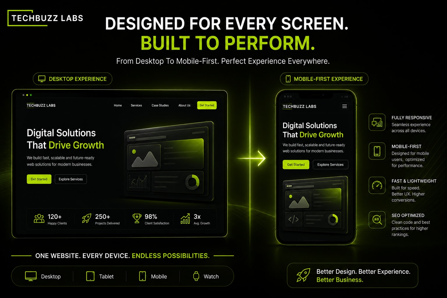
Responsive design adapts layouts to different screen sizes. The website is usually designed for desktop first and then adjusted for tablets and mobile devices.
Mobile first design takes the opposite approach.
The website is designed primarily for mobile users first, then expanded for larger screens.
The difference matters because user behavior has changed dramatically.
Most visitors now interact with websites through smartphones. This means mobile experience directly impacts SEO, bounce rates, and conversion performance.
Responsive design still works well for many businesses, especially content heavy websites and platforms that require complex layouts.
However, mobile first design offers significant advantages in speed, simplicity, and user experience.
A mobile first approach forces businesses to prioritize clarity and performance. Important information appears faster, navigation becomes simpler, and pages load more efficiently.
Google also prioritizes mobile experience in ranking signals.
Websites that load slowly or perform poorly on mobile devices often struggle in search results.
Another major factor is conversion behavior.
Mobile users expect quick actions. Whether booking a service, filling out a form, or making a purchase, the experience must feel seamless.
In 2026, the question is no longer whether mobile matters.
The real question is how optimized your mobile experience actually is.
The best websites today combine responsive flexibility with mobile first thinking.
That balance creates faster, cleaner, and higher converting digital experiences.